



Most branding projects that disappoint do not fail at the design stage. They fail before a designer opens a file, in the weeks of back-and-forth that follow, or in the months after delivery when nobody knows how to use what they paid for.
We sit on the client side of a lot of these projects. Below is what consistently separates the ones that work from the ones that end with a business owner quietly avoiding their own logo.
1. Decide what the brand has to do before you hire anyone
A brand identity is not decoration. It has a job, and that job changes what it should look like.
An identity that has to win a partnership meeting with an established company looks nothing like one that has to stop a shopper in an aisle. One needs to signal that you already belong in the room. The other needs to be visible at three feet in a crowd of competitors. Both are correct answers to different questions.
You do not need a strategy document to start. You need clear answers to three things:
1. Who is the audience, specifically enough that you could name three of them.
2. What do you want them to assume about you before you have said a word?
3. Where will they encounter this first, and what does that surface allow?
If you cannot answer these, the project has not started yet, whatever the designer is doing.
2. Expect your mental picture to change

Almost every business owner arrives with an image already in their head. Almost none of those images survive being drawn.
That is not a failure of the designer or the client. It is what concepts are for. An idea that felt vivid and specific in your imagination turns out to be one of four possible executions, and seeing all four is what tells you which one you actually meant.
The practical implication is how you write your brief. Describe the feeling and the job rather than the artwork.
“Precise, established, understated, has to look credible next to companies twenty years older than us” gives a designer somewhere to go.
“A circle with a leaf in it” gives them a specification, and specifications are how you end up with something technically correct that nobody likes.
Treat your original idea as a hypothesis worth testing, not a requirement to be executed.
3. Feedback is the part you control
The quality of the final identity is largely a function of the quality of the feedback. This is the single biggest variable a client owns.
What good feedback looks like:
1. React to fit, not taste. “This reads too casual for the audience we are pitching” moves the work. “I
do not like the blue” does not.
2. Give the reason behind every request. The reason lets a designer solve the actual problem,
sometimes in a way you had not thought of.
3. Consolidate. Ask for every concept in one place before you comment, then send one set of notes.
Feedback scattered across six emails over a weekend produces revisions that contradict each
other.
4. Say what is working, not just what is not. Designers narrow toward the parts you keep.
5. Name your direction as soon as you have one. Deciding at round three which concept is the spine,
then refining, is far faster than keeping four alive out of politeness.
The strongest signal you can send is subtraction. Some of the best marks we have delivered got there because the client asked for elements to come out rather than go in.
4. A logo is not a brand
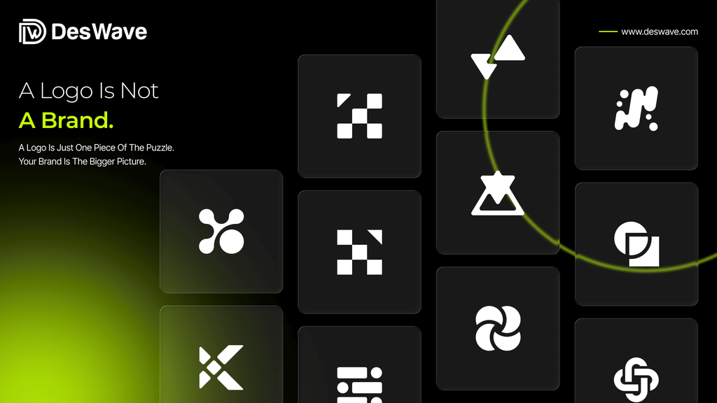
A logo file is the part you can see. The rest of the package is what makes the logo usable by people who are not designers, which is to say everyone who will actually touch it.
A complete identity should include:
1. A primary logo, plus a secondary or emblem version for tight and square spaces.
2. An icon or monogram that works on its own, at very small sizes and on physical products.
3. Colorways for light backgrounds, dark backgrounds, single color, and black and white.
4. Exact color codes in HEX, RGB, and CMYK.
5. A typography system with a clear hierarchy, not just the font used in the logo.
6. Clear space and minimum size rules.
7. Source files you own outright, in editable vector format.
8. Applied examples showing the identity on the things you will actually produce.
The unglamorous items on that list are the ones that determine whether your brand still looks like one brand a year from now.
Exact color codes are what let your apparel supplier, your printer, your sign maker, and your web developer produce the same green. Without them, you get four greens and a brand that feels slightly off everywhere without anyone being able to say why.
5. Design for where the brand will physically live

Screens forgive almost everything. Physical production forgives nothing.
Before the identity is finalized, it should be tested against its real destinations.
Embroidery cannot hold fine detail. Thin strokes disappear when a mark is stitched onto a cap or etched onto a small product. A logo that needs three colors becomes a problem the moment someone quotes you for single-color printing. An app icon is a square, and a wide horizontal wordmark does not fit in a square.
This is why applied mockups matter. They are not there to make the presentation look impressive. They are the test that catches an expensive problem while it is still free to fix.
If you know you will produce apparel, packaging, signage, or physical products, say so at the start. It changes what a good answer looks like.
6. Where branding projects actually break
1. Too many decision makers. Every additional opinion holder adds rounds and pulls the work
toward the average of all tastes in the room, which is nobody’s taste.
2. No single owner. Someone has to be able to say yes. If approval requires assembling four people,
expect the timeline to double.
3. A vague brief paired with specific expectations. If you have a non negotiable requirement, it
belongs in the brief, not in round four.
4. Revisions without reasons. Changes requested without rationale produce work that drifts rather
improves.
5. Treating guidelines as a formality. The document you never open is the reason your brand falls
apart at the edges.
6. Stopping at the logo. A mark with no system around it means every future asset is a fresh
negotiation.
7. What success looks like six months later
Judge the work on these, not on how you felt the day you approved it:
1. Someone who is not a designer can produce a correct branded asset without asking you or us
anything.
2. It holds up in the room that matters, whether that is a retail buyer, a partner, or a customer
comparing three options.
3. It has stretched to things nobody planned for at the start, because the system was built to stretch.
4. Your materials look like they came from one company.
5. You reach for it rather than around it.
The short version
Know what the brand has to accomplish before you commission it. Brief the job rather than the artwork. Give consolidated feedback with reasons attached. Insist on the full system, not just the file you can see. Test it against physical reality before you sign off.
Do those five things and the design work has room to be good. Skip them and no amount of design talent will rescue the outcome.
If you are weighing up a branding project and want to talk through what your identity actually needs to do, we are happy to have that conversation before any money changes hands.